Business stationery
Table of Contents
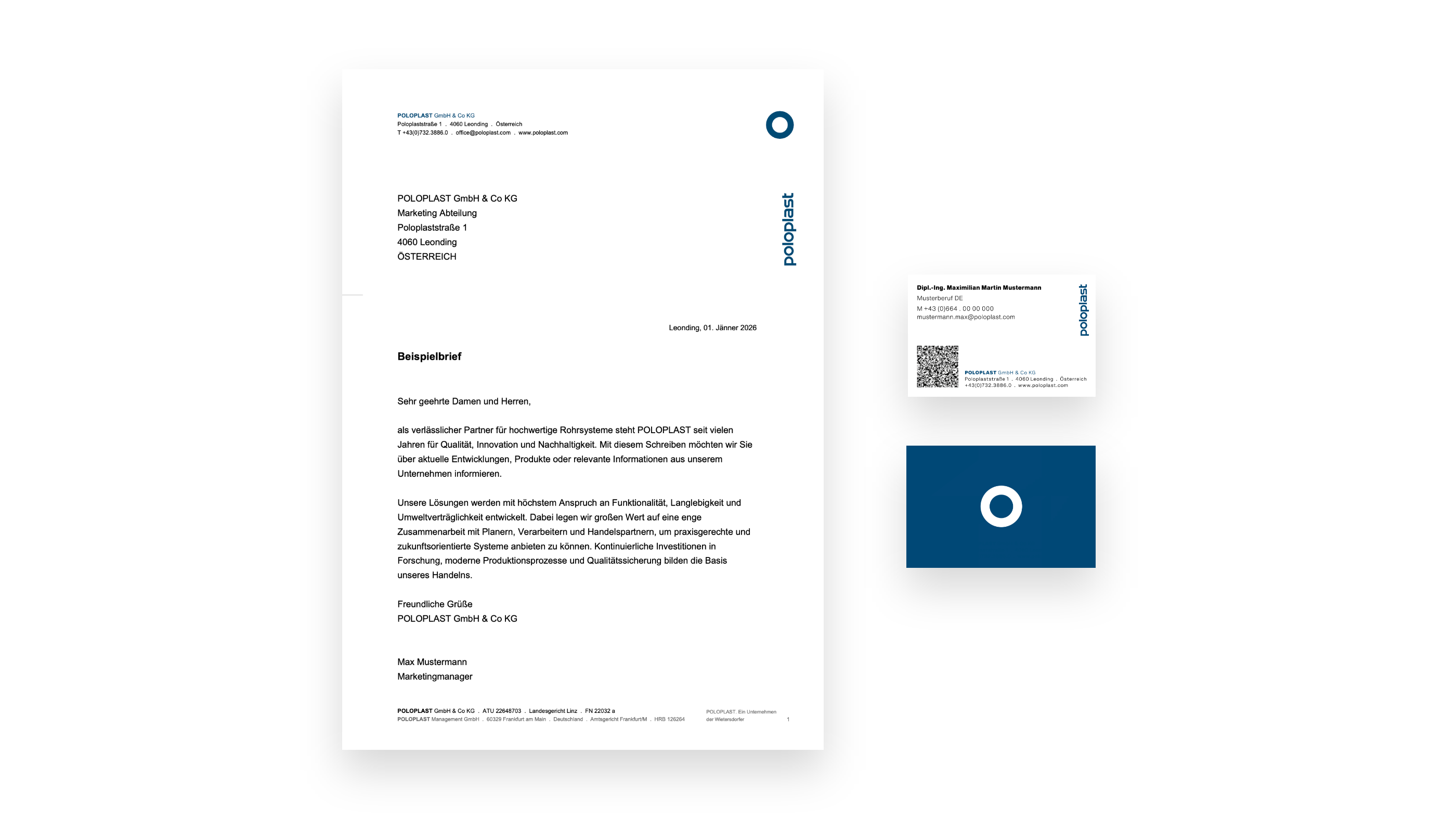
Letterhead and business card
The example shown illustrates the application of the core design elements on letterheads and business cards. It demonstrates the consistent use of the defined typography, the clearly structured grid layout, and the brand‑specific colour and visual language.
The reduced layout creates a sense of calm and supports a professional, technical appearance.
The logo, contact information and functional elements such as QR codes are positioned with precision to ensure high recognisability and a cohesive appearance across all printed materials.
On the letterhead, the grid must be extended to 25 mm on the binding (punch) side (left in the example).
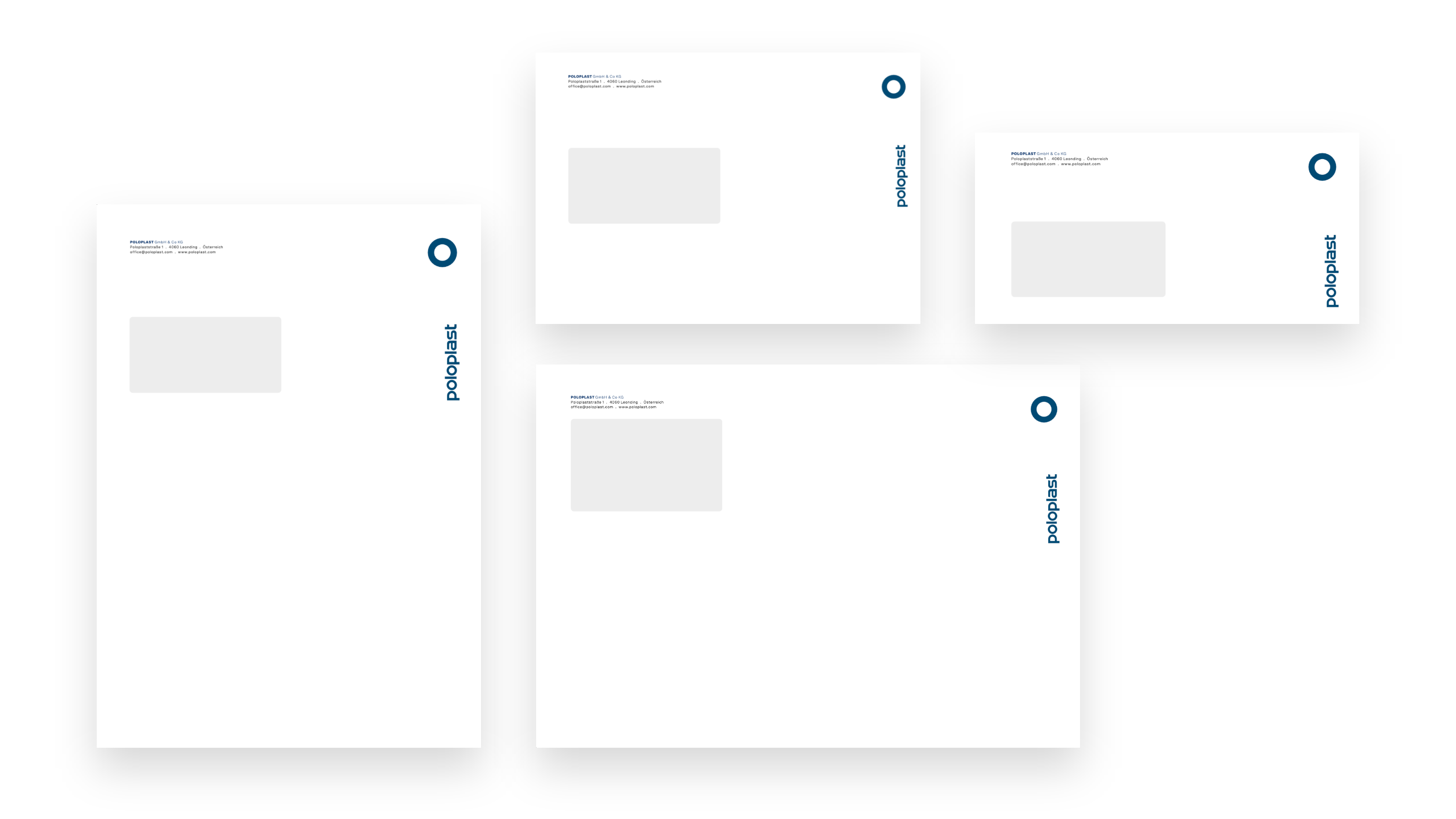
Envelopes
The envelopes demonstrate a consistent design across different formats. Sender details, the logo and the brand colour are clearly positioned, while generous white space creates a calm and precise appearance. The consistent placement of the brand mark and typographic elements ensures a coherent and instantly recognisable look across all printed materials.